Dashboards
The CloudPi Dashboard serves as a unified platform for monitoring and managing your cloud environment. It provides rich visualizations and interactive reports that give teams a clear understanding of costs, resources, and project performance across multiple cloud providers.
The dashboard is role-based and project-aware — ensuring every user views insights that are relevant, actionable, and aligned with their responsibilities.
Key Features of the Dashboard
Centralized Cloud Insights
The CloudPi Dashboard aggregates data across all projects into a single interface, providing:
- Cost Reports - Detailed cost analysis and breakdowns
- Budget Tracking - Monitor budget consumption and forecasts
- Showback Reports - Allocate costs to departments and teams
- Executive Reports - High-level summaries for leadership
After choosing the dashboard type, select a specific dashboard name from a list tailored to your project needs.
Customizable Data Visualization
Filters Available:
- Date Range - Choose time periods (e.g., Last 90 Days, Month to Date, Till Date)
- Top N - Select top items to display (e.g., Top 10 + Others)
- Granularity - Switch between Daily, Monthly, or Quarterly views
- Cloud Provider - Filter by AWS, Azure, GCP, or view combined data (All Providers)
- Projects - Focus on selected projects
- Cost Type - Filter by Billed Cost or other cost types
This allows you to focus on particular areas of interest within your cloud environment.
Navigating the Dashboard
Accessing the Dashboard
- Log in to your CloudPi account.
- From the left navigation menu, click on the Dashboard icon.
- The main Dashboard page opens, displaying an overview panel with filters and visual reports.
Selecting Dashboard Types
At the top of the dashboard, you'll find multiple dropdown filters that control what type of data is displayed.
Use the Dashboard Type dropdown to choose the desired view — for example:
- Executive - High-level cost overview with key metrics
- FinOps - Financial operations and cost governance reports
- Technical - Resource utilization and performance reports
Dashboard options are dynamically customized based on:
- Your selected project(s)
- Your user role (e.g., Admin, Executive, FinOps Analyst)
This ensures that each user views insights that are relevant to their scope and responsibilities.
Choosing Specific Reports
After selecting the Dashboard Type, additional dropdowns appear for further customization:
-
In the Dashboard Name dropdown, choose the specific report you want to view — for instance, Executive Report, Cost by Projects, Budget Overview, or Resource Utilization.
-
You can also select:
-
Date Range - Time period for analysis
- Top N - Number of top items to display
- Granularity - Daily, Monthly, or Quarterly
- Cloud Provider - AWS, Azure, GCP, or All Providers
- Projects - Specific projects to include
The dashboard then updates automatically, showing relevant charts and tables for your selection.
Dashboard Components
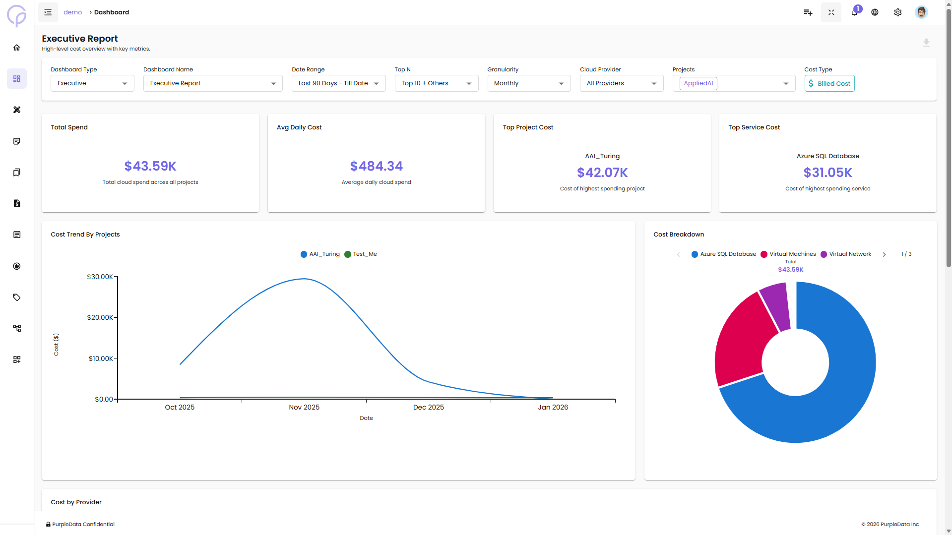
Executive Report View
The Executive Report provides a high-level cost overview with key metrics:
Summary Cards:
- Total Spend - Total cloud spend across all projects
- Avg Daily Cost - Average daily cloud spend
- Top Project Cost - Cost of highest spending project
- Top Service Cost - Cost of highest spending service
Visualizations:
- Cost Trend By Projects - Line chart showing cost trends over time for each project
- Cost Breakdown - Donut chart displaying cost distribution by service (e.g., Azure SQL Database, Virtual Machines, Virtual Network)
Customizing Data Views
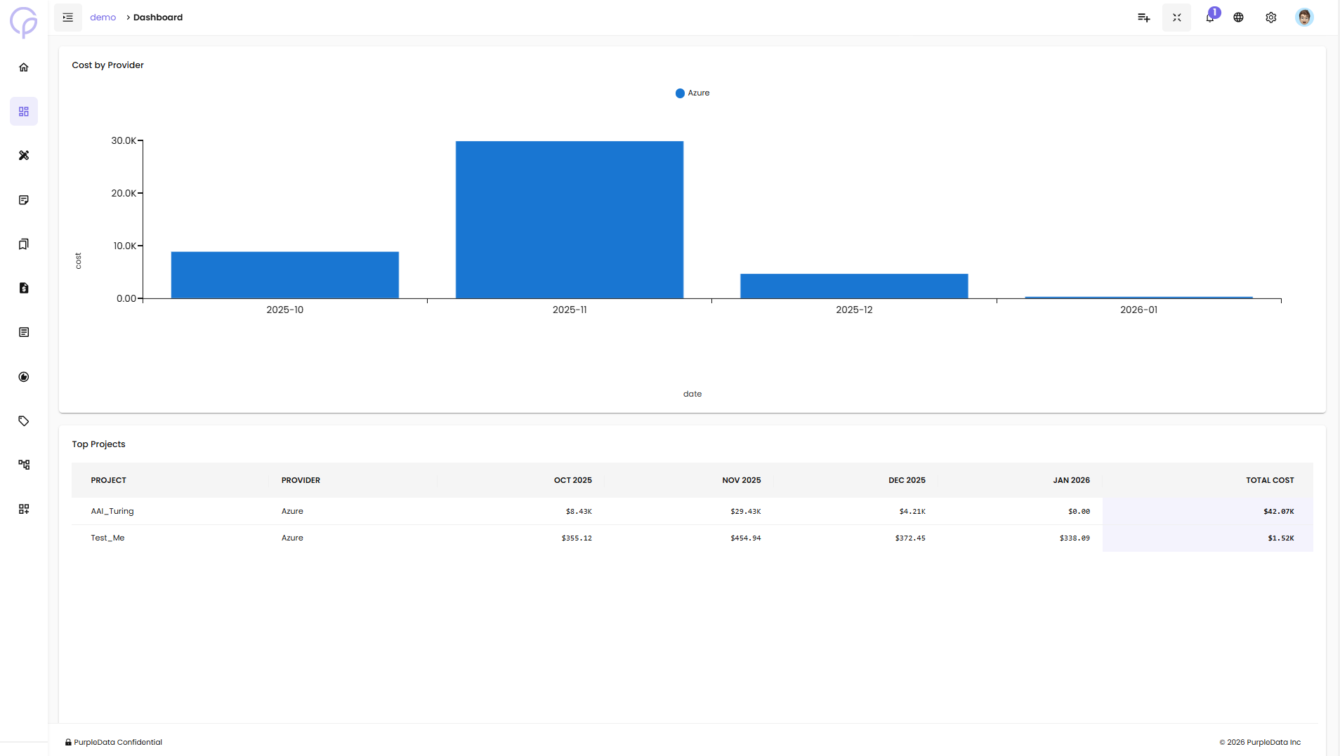
You can refine and personalize your dashboard data using filters located across the top:
- Date Range Filters - Analyze cost and usage trends across specific time frames
- Granularity Filters - View your data at daily, monthly, or quarterly levels for trend analysis
- Cloud Provider Filters - Narrow your view to a particular cloud provider or compare across all
- Project and Dimension Filters - Focus on specific projects, services, or custom tags